We’ve recently worked on some visualizations in Tableau and overall it’s been great. Tableau is absurdly easy to drag and drop your way to really slick, interactive visualizations. If you need to build visualizations and you’ve got the money for a license, it’s well worth it.
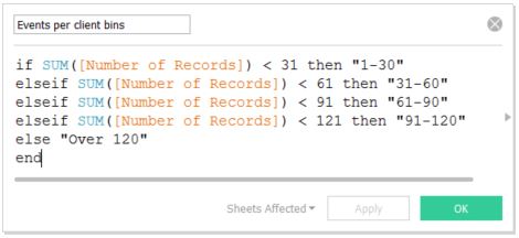
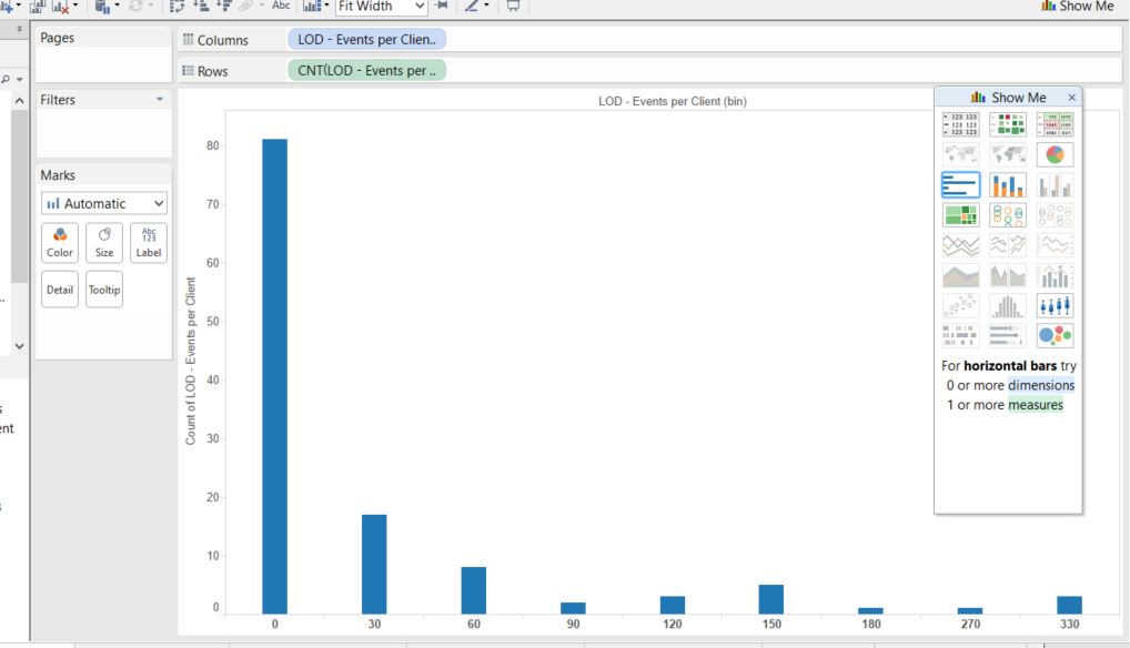
One task that was a bit of an issue during that project was building bins by aggregate. Visualizing “How many had how many?” was surprisingly kludgy in Tableau 8.0. Each record in our dataset represents an event, and each has an associated “client”. We wanted to look at how many clients had how many events. The solution we found was to build a calculated field that created the bin category for each client:
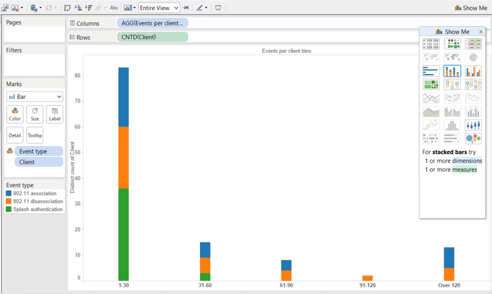
Then, the chart could be constructed by placing the resulting measure in a column and a distinct count of Client in the Rows, then adding The Client dimension as a detail (Event type added as a color for fun):
In Tableau 9 we can use Level of Detail expressions. To generate the same chart we first create a new generated field:
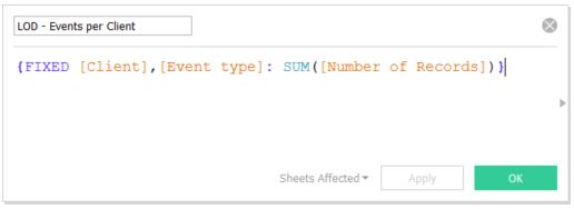
You may notice that in addition to setting “Client” as a fixed field, we also fix “Event Type”. This is a necessary step that enables us to use Event type as a detail in the chart.
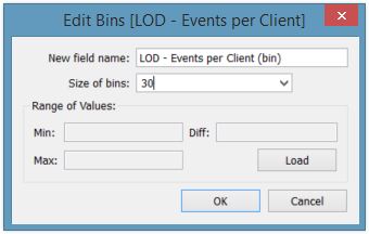
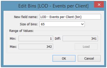
We next highlight the new calculated field in the Measures section and click the histogram view in the “Show Me” section. This will create default bins for the new field and display it on the screen. But, we’re not done yet. We want to adjust the bin size to match what we had in our original chart. To do this, find the new bin Dimension, right click, and click “Edit…”. Then, set the “Size of bins” field to 30 and click OK.
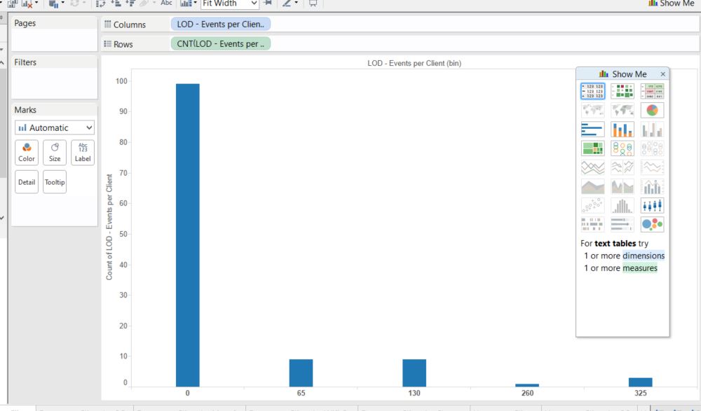
You’ll notice that this creates a similar looking chart, but we have way more bins than before. In the previous chart, we grouped anything over 120 in the same bin. We can either adjust the bin size to match the number of bins used previously, or create another calculated field to mimic the original chart. For the first option, we can edit the bin field, click “Load” then divide the “Max” field by the number of bins we want, and round down as desired:
This produces a pretty uneven histogram:
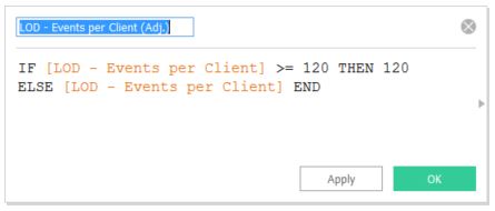
So instead, we’ll recreate the original chart by adding an adjusted field, then making the histogram from that field instead, and setting the bin size back to 30. We’ll also add the Event Type back in to add a little color:
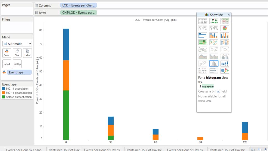
And that brings us right back where we started. This wasn’t exactly what we wanted, but it is closer. It takes slightly more work to set up the chart, but the nice thing is that as the data changes all we have to do is adjust the max value in our adjusted field and possibly the size parameter on the bin, rather than manually editing the binning function we started with. It would be nice to set the bins dynamically by providing a # of bins option as an alternative to the bin size. As our underlying data changes client counts may move towards the high end of the spectrum unless we adjust the bin size (and the associated “adjusted” field). All in all, I like the new approach better, and I’m looking forward to digging into LoD expressions to see what else it can do.