In the last post, we looked at how to generate and interpret learning curves to validate how well our model is performing. Today we’ll take a look at another popular diagnostic used to figure out how well our model is performing.
The Receiver Operating Characteristic (ROC curve) is a chart that illustrates how the true positive rate and false positive rate of a binary classifier vary as the discrimination threshold changes. Did that make any sense? Probably not, hopefully it will by the time we’re finished. An important thing to keep in mind is that ROC is all about confidence!

No. Not that confidence. Although… we are aiming to find out if we’re good enough and smart enough.
Let’s start with a binary classifier. It’s entire aim is to determine which of two possible classes an example belongs to. We can arbitrarily label one as False and one as True. Sometimes it will be easy to determine which is which, but sometimes the classes are qualitative like “blue” or “red” and then you might think about it as True == Blue and False == Not Blue. At any rate, let’s just think about true and false.
The classifier will (hopefully) identify some examples as true and some as false. Some of these predicted true examples actually are true. The percentage of known true examples that the model identifies as true is the True Positive Rate (TPR). Similarly, the False Positive Rate (FPR) is the percentage of known false examples that the model identifies as true. We clearly want TPR to be 1.0 and FPR to be 0.0, as that would be a perfect classifier. We can build a very simple chart called a confusion matrix (which is also used in cases with more than 2 classes) which is a summary table for the actual values compared to the predicted values. The wikipedia page has several great versions of this chart so look there (link at the end of the post) but here’s another one of my fantastic illustrations:
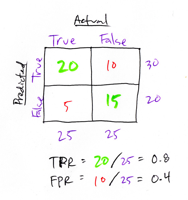
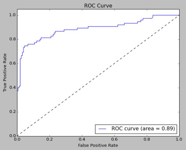
This confusion matrix shows the TPR and FPR for the model output. This output is generated by scikit-learn’s RandomForestClassifier which only outputs 1’s and 0’s. Technically, you can’t use this for a ROC curve, because there is no concept of confidence in the Classifier output – it’s either a 1 or 0. But, we CAN use the probability scores for each prediction which is a slightly different function in the RandomForestClassifier. A score of .5 basically is a coin-flip, the model really can’t tell at all what the classification is. When determining predictions, a score of .5 represents the decision boundary for the two classes output by the RandomForest – under .5 is 0, .5 or greater is 1. To generate the ROC curve, we generate the TPR and FPR values using different decision boundaries, and plot each point TPR/FPR as we go.
What does this tell us? It doesn’t tell us how accurate the model is, we only need to know the classification error for that. By moving the decision boundary and testing along the way, we discover how accurate the model’s confidence is. For example: Let’s say there’s a model that any time it scores an example less than .4, or any time it scores above .6, it is correct. In between the two the model makes lots of mistakes though, but whenever it has strong predictions (or even medium ones) it’s always correct. Perhaps there’s another model that is only perfectly correct below .2 and above .8, but in between the two it makes mistakes uniformly at a low rate. These two models may have the exact same classification error, but we know that the first model is more “trustworthy” for the clear-cut cases, and the second is more trustworthy for the more vague cases.
Additionally, we can use the ROC curve to adjust the model output based on business decisions. Let’s say a False Positive doesn’t have much real-world consequences but a False Negative is VERY costly. We can use the ROC curve to adjust the decision boundary in a way that may reduce the overall accuracy of the model, but may be beneficial for the organization’s overall objective.
We can compare the curves of two different models (wait, what are we talking about here?) to get an idea of which model is more trustworthy. A single, objective number can tell us definitively which model is more trustworthy: AUC. It’s as simple as it sounds, just calculate the area under the curve and the value will be between 0 and 1. So what does AUC mean mathematically? Technically, it’s the probability that a randomly selected positive example will be scored higher by the classifier than a randomly selected negative example. If you’ve got two models with nearly identical overall accuracy, but one has a higher AUC… it’s may be best to go with the higher AUC.
Code to generate the plot in scikit-learn and matplotlib:
import matplotlib.pyplot as plt
from sklearn.metrics import roc_curve, auc
from sklearn.cross_validation import train_test_split

# shuffle and split training and test sets
X_train, X_test, y_train, y_test = train_test_split(X, y, test_size=.25)
forest.fit(X_train, y_train)

# Determine the false positive and true positive rates
fpr, tpr, _ = roc_curve(y_test, forest.predict_proba(X_test)[:,1])

# Calculate the AUC
roc_auc = auc(fpr, tpr)
print 'ROC AUC: %0.2f' % roc_auc

# Plot of a ROC curve for a specific class
plt.figure()
plt.plot(fpr, tpr, label='ROC curve (area = %0.2f)' % roc_auc)
plt.plot([0, 1], [0, 1], 'k--')
plt.xlim([0.0, 1.0])
plt.ylim([0.0, 1.05])
plt.xlabel('False Positive Rate')
plt.ylabel('True Positive Rate')
plt.title('ROC Curve')
plt.legend(loc="lower right")
plt.show()
and it will look something like this:
So that’s about the end of this series. In the last post, we’re going to wrap this whole thing up!
More on ROC Curves and AUC:
- (Wikipedia) Receiver Operating Characteristic
- (Scikit-learn) Receiver Operating Characteristic
- More on ROC/AUC
- ROC curves and Area Under the Curve explained (video)
Kaggle Titanic Tutorial in Scikit-learn
Part I – Intro
Part II – Missing Values
Part III – Feature Engineering: Variable Transformations
Part IV – Feature Engineering: Derived Variables
Part V – Feature Engineering: Interaction Variables and Correlation
Part VI – Feature Engineering: Dimensionality Reduction w/ PCA
Part VII – Modeling: Random Forests and Feature Importance
Part VIII – Modeling: Hyperparamter Optimization
Part IX – Bias, Variance, and Learning Curves
Part X – Validation: ROC Curves
Part XI – Summary