In the previous post, we took at how we can search for the best set of hyperparameters to provide to our model. Our measure of “best” in this case is to minimize the cross validated error. We can be reasonably confident that we’re doing about as well as we can with the features we’ve provided and the model we’ve chosen. But before we can run off and use this model on totally new data with any confidence, we would like to do a little validation to get an idea of how the model will do out in the wild.
Enter: Learning Curves. This was my favorite part of Andrew Ng’s Coursera Machine Learning course. In essence, what we’re doing it training the exact same model with increasingly large fractions of our total training data, and plotting the error of the training and test sets at each step. So, if we have 10000 training examples, we may hold out 1000 of them as the test set and use the other 9000 for training. So, first we’ll train out model with our ideal parameters and 100 random examples out of the 9000. We’ll plot both the train error and the error of the resulting model on the test set. We’ll repeat with 500 out of the 9000. Then 1000, etc. This plot provides two curves and tells us a remarkable amount about how good our model is.
I’ve essentially ripped off Professor Ng’s slides here, so you’ll be much better served to sign up for the next offering of his course if you haven’t already taken it. No seriously, take his course. I’m not kidding, it’s really great. In the meantime, here are representations of the 4 general shapes you’ll see:
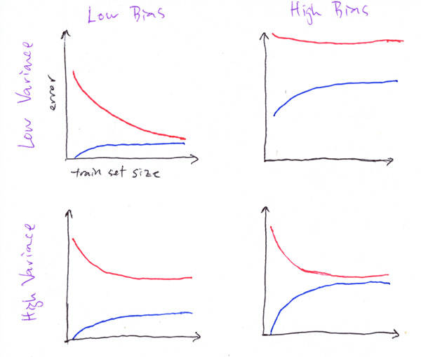
1) On the top left, you’ve got a winner. Low training error and generalizes well. Put this in production now.
2) Top right, you’ve got a dumpster fire. Your model can’t learn the training examples well AND you’re generalizing even worse. Time to go back to the drawing board.
3) Bottom left, high variance means that the model hasn’t figured out a representation of the data that also fits new data
4) Bottom right, high bias means that the model hasn’t figured out the training data very well.
Bias and Variance is the name of the game. They’re two opposing sources of error in supervised learning models, and learning curves help us to zero in on which of the two (and hopefully not both) our model is suffering. High variance with low bias is also known as “overfitting” and represents a situation where the model has incorrect assumptions that do not apply well to new examples. High bias with low variance is also known as “underfitting” and represents a situation where the model simply has not learned how to estimate the target from the data. There are clear approaches to addressing either of these issues, but typically they come at the expense of the other.
For example, if you have high variance, one common solution is to add more features from which to learn. This very frequently increases bias, so there’s a tradeoff to take into consideration. There’s a ton out there about how to make adjustments to address these issues. The links at the end of this post will provide more info.
Let’s take a look at the code to generate a learning curve in scikit-learn:
## Adapted from http://scikit-learn.org/stable/auto_examples/plot_learning_curve.html
import matplotlib.pyplot as plt
from sklearn.learning_curve import learning_curve

# assume classifier and training data is prepared...

train_sizes, train_scores, test_scores = learning_curve(
        forest, X, y, cv=10, n_jobs=-1, train_sizes=np.linspace(.1, 1., 10), verbose=0)

train_scores_mean = np.mean(train_scores, axis=1)
train_scores_std = np.std(train_scores, axis=1)
test_scores_mean = np.mean(test_scores, axis=1)
test_scores_std = np.std(test_scores, axis=1)

plt.figure()
plt.title("RandomForestClassifier")
plt.legend(loc="best")
plt.xlabel("Training examples")
plt.ylabel("Score")
plt.ylim((0.6, 1.01))
plt.gca().invert_yaxis()
plt.grid()

# Plot the average training and test score lines at each training set size
plt.plot(train_sizes, train_scores_mean, 'o-', color="b", label="Training score")
plt.plot(train_sizes, test_scores_mean, 'o-', color="r", label="Test score")

# Plot the std deviation as a transparent range at each training set size
plt.fill_between(train_sizes, train_scores_mean - train_scores_std, train_scores_mean + train_scores_std,
                 alpha=0.1, color="b")
plt.fill_between(train_sizes, test_scores_mean - test_scores_std, test_scores_mean + test_scores_std,
                 alpha=0.1, color="r")

# Draw the plot and reset the y-axis
plt.draw()
plt.show()
plt.gca().invert_yaxis()
And this will generate a learning curve that might look something like this:
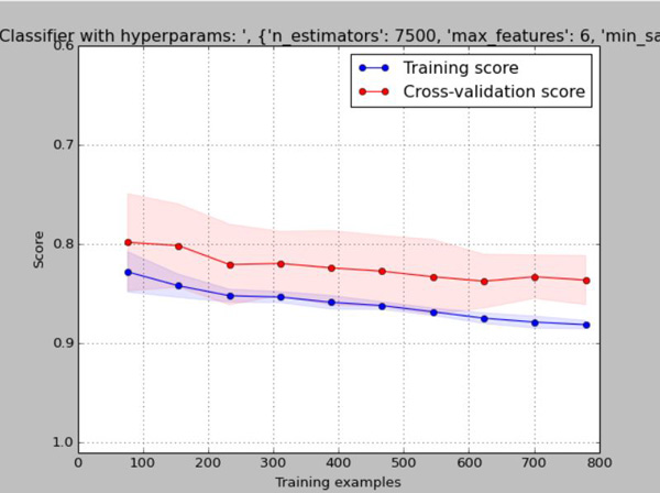
Wait a minute, this doesn’t look like any of those expertly illustrated diagrams above, what gives? It turns out, things don’t always look like they do in theory. In our case, the fact that the training error doesn’t start low and get worse as the number of training examples increases tells us something either about our data, or about our model. What we’re seeing is that both the training and test error starts not so great, but both slowly and steadily get better as the number of examples increases. This is a huge indication that acquiring more training data should improve our model, but since this is the Kaggle Titanic competition, there is no more data to obtain.
Further digging into my model parameters, I realized that in an earlier hyperparameter optimization run, I found that the best scores were coming at a “min_samples_split” value of 40, which is what I’ve been using for a while. Thinking about it, if you have to have 40 samples in order to perform a split and you’re only training from 1/10th of the data (~80 examples), you’re only going to be able to perform a very small number of splits. Sure Random Forests are an ensemble of weak learners, but this is too weak. This makes it super clear why the more examples are available, the better it does (each tree can grow deep enough to contribute meaningful knowledge). We could either increase the number of trees by a ton, or we could reduce the min_samples_split to something like 1% of the data size. Doing exactly that, we get something that looks like one of our nice clean, theoretical models:
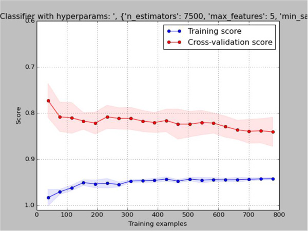
This is a clear cut case of high-variance, low-bias overfitting. Is this better than what we had before? I’d say probably not, despite the fact that the training error is much, much better. The test error and standard deviation are almost identical in both cases, but the model is less consistent. So the effect of changing the RandomForest parameters is essentially that of regularization. We’re handicapping the model by making it tougher to learn specific details of the data it trains on. There are three typical ways to reduce variance (which will inherently come at the expense of bias, but our training score is so high we can afford it).
– Regularization (we’ve just tweaked this with no effect on test error, but maybe we can finely tune it)
– Decrease the number of features (we can tweak the thresholds for correlation and/or feature importance, to end up with fewer features)
– Use more training examples (not possible)
If none of these approaches helps us to increase our test set error then we may have to consider giving up on the RandomForest and looking for a more complex algorithm such as a Gradient Boosting Machine or Deep Learning (I kinda want to do that anyway!).
More on Bias/Variance tradeoff:
More on Learning Curves:
- Andrew Ng’s Advice for applying machine learning
- Practical advice for machine learning
- (Scikit-learn) Plotting Learning Curves
Kaggle Titanic Tutorial in Scikit-learn
Part I – Intro
Part II – Missing Values
Part III – Feature Engineering: Variable Transformations
Part IV – Feature Engineering: Derived Variables
Part V – Feature Engineering: Interaction Variables and Correlation
Part VI – Feature Engineering: Dimensionality Reduction w/ PCA
Part VII – Modeling: Random Forests and Feature Importance
Part VIII – Modeling: Hyperparamter Optimization
Part IX – Bias, Variance, and Learning Curves
Part X – Validation: ROC Curves
Part XI – Summary