I recently came across a new python package for visualizing missing elements of a data set. The aptly named “missingno” is super useful when you’re taking your first look at a new data set and trying to get a feel for what you’re working with. Having a sense of the completeness of the data can help inform decisions about how to best handle missing values. In this post, we’ll take a quick look at the small and simple Shelter Animal Outcomes data set from one of the current Kaggle competitions.
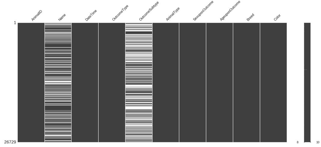
Matrix visualization
The first visualization is the “matrix” display. This is a representation of where data is missing in each column – any gaps in the bar are missing values. If a column is missing values for a very small number of records, then perhaps these are incomplete rows that should be discarded, or maybe we could attempt to predict the value, or simply set it to the most common/average value. On the other hand, if the column only has a value for half of all rows, then attempting to populate the missing values may just introduce a lot of noise. In the shelter animal outcomes dataset, there are two columns that have a considerable amount of missing data:
import pandas as pd
import missingno as mn
%matplotlib inline

df = pd.read_csv('data/train.csv')

mn.matrix(df)
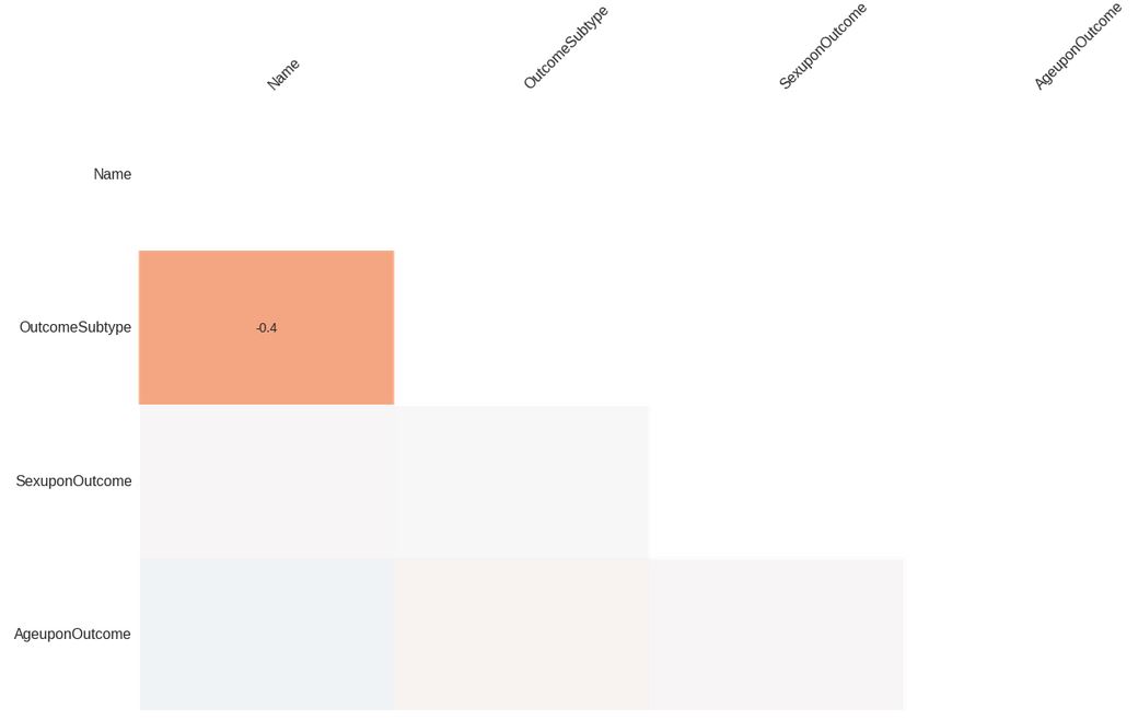
Heatmap visualization
Aside from identifying the proportion of each column that’s missing, we can also use the “heatmap” visualization to understand the relationship of missing values between pairs of columns. By inspecting the nullity correlation of column pairs, we can get a sense of columns whose values are directly or inversely related. For example, if we had a data set of species and one column was number of limbs and another was number of fingers, we’d see a relationship – species who don’t have limbs also don’t have fingers, so there is some relationship between those two columns.
One thing to note is that any columns that have no missing values will not show up in the heatmap. The remaining columns will appear with their correlation value between -1 and 1, and if the value rounds down to 0 (>-0.05 or < 0.05) then no value will be displayed. A value of -1 means that in all cases, when the first column is missing then the second column is not missing. A value of 1 means that in all cases, when the first column is missing the second column is missing also. In the shelter animal outcomes dataset, A value of 0 represents no correlation at all. For the shelter animal outcomes data set, there are are only two correlated columns:
mn.heatmap(df)
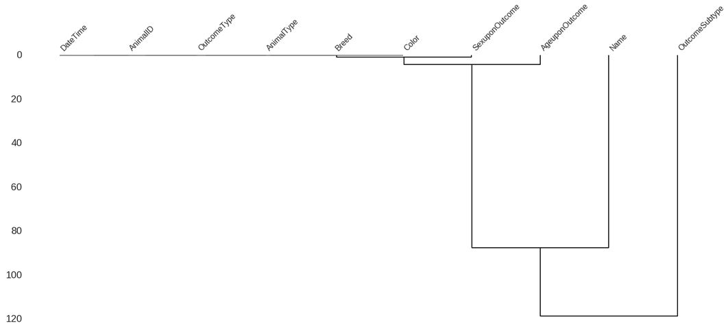
Dendrogram visualization
Finally, we also have a “dendrogram” visualization that shows a tree representing groupings of columns that have strong nullity correlations. This takes the heatmap one step further and identifies groups that are correlated, rather than simple pairs. In the case of the shelter animal outcomes dataset, there are no strongly correlated groups and the bulk of the columns have no null values and are grouped together:
mn.dendrogram(df)
Links
We of course always like to see/use opensource, and the code for missingno can be found on github
The code for this example lives in a ipython notebook I’m working on for the Kaggle competition. It will eventually contain other exploratory code as well, but for now it’s all missingno stuff.